.png)
AI Therapy Web App
My role: Branding & UX/UI designer
This project is a web app designed to support women in toxic relationships. I worked on both the user interface and the branding, focusing on making the experience feel safe, calming, and easy to use, especially during emotionally difficult moments.

Brand Identity
I loved the feminine & bold characteristics of this font, reflecting strength & elegance at the same time. I played with the "Y" letter, which mimics either a scarf in the wind or a woman's flowing hair, to portray a symbol of freedom and liberation.
This design element captures the essence of the emotional release and empowerment that a woman experiences when she escapes a toxic relationship, making it a perfect representation of the app’s mission to support and uplift its users.
Understanding the User
Persona
Problem statement:
Daniel is a talented yet introverted junior developer who struggles with interview anxiety and self-expression under pressure. He’s looking for a safe, supportive way to practice answering questions and get meaningful feedback to build his confidence.

How Might We
-
Over time, users want to see recurring toxic behaviors, like how often their partner uses blame or control tactics.
-
Users expect the app to accurately detect manipulation, gaslighting
-
Users value clear feedback on the tone and intent of messages.
-
Beyond just analysis, users hope to walk away with suggestions: ways to respond, affirmations

Challenges
Ideation
When you work on a project by yourself, the brainstorming process is such a challenge! A possible trap is not organizing your time well and thinking too much about solutions, because you are alone and you have no one to consult with.
To stay focused, I anchored my decisions around the user journey and made sure each design choice aligned with Emma’s emotional needs. I also structured my process into small, manageable steps helping me move forward with clarity and purpose.
Starting the design


Problem solution
The first two screens introduce the home page, where users can immediately paste a message and request an interpretation. This direct access was designed to solve a key pain point -> users often felt overwhelmed and emotionally drained, needing quick support without navigating through complex menus. From a UX perspective, simplifying this entry point allows users to feel seen and supported right away, creating a sense of ease and emotional safety in moments of distress.


These next two screens focus on empowering the user through clarity and pattern recognition. After submitting a message, the app generates an analysis grouped under manipulation categories such as Gaslighting, Victimisation etc. Each category comes with a brief explanation tailored to the user's specific message, helping them understand not just what is happening, but why it matters. The profile screen complements this by displaying a list of the most common manipulation tactics the user has encountered, offering a sense of continuity and helping them recognise recurring patterns over time.


From a UX perspective, this structure turns emotional confusion into insight, offering gentle guidance without overwhelming the user.
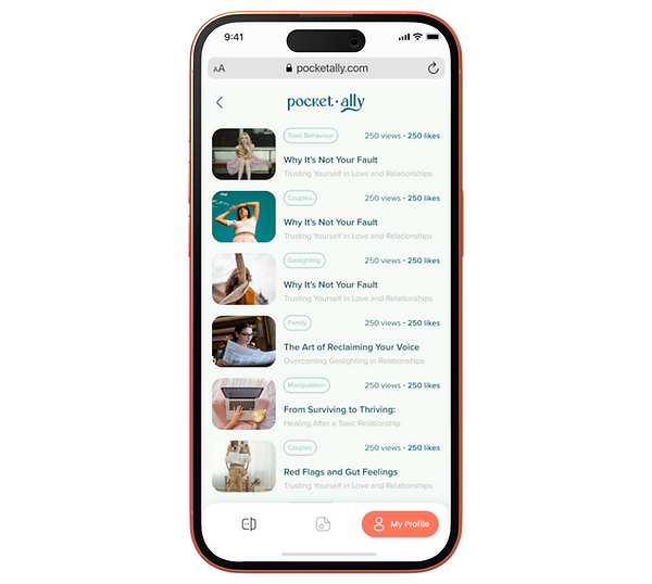
The final screens are designed to offer ongoing emotional support through education. The blog page gives users access to carefully curated articles on topics like manipulation, relationships, and healing, helping them feel informed and understood. The second screen allows users to revisit their favourite reads from the profile page, creating a personal, calming space for reflection. From a UX perspective, these features extend the app’s value beyond a single interaction, encouraging users to grow their awareness at their own pace and return whenever they need support.

.png)